Southeastern Pennsylvania Transportation Authority (SEPTA)
SEPTA.org Website Redesign
SEPTA Prioritizes Customer Needs, Usability, and Realtime Data in UI/UX Overhaul of Key Web Products.
The Challenge:
Create a modern mobile-friendly website that puts customer needs first, merges multiple products, and introduces new features and branding.
How We Helped:
McCormick Taylor’s Creative + Technology Services team collaborated
closely with SEPTA stakeholders to design and deliver a reimagined transit-forward website. We did so by
conducting an in-depth Discovery Phase aimed at identifying our audience, the challenges they encounter
using the site, and their ideal SEPTA web experience. As a result, our primary goal in Design was to shift
the site’s focus toward what customers need.
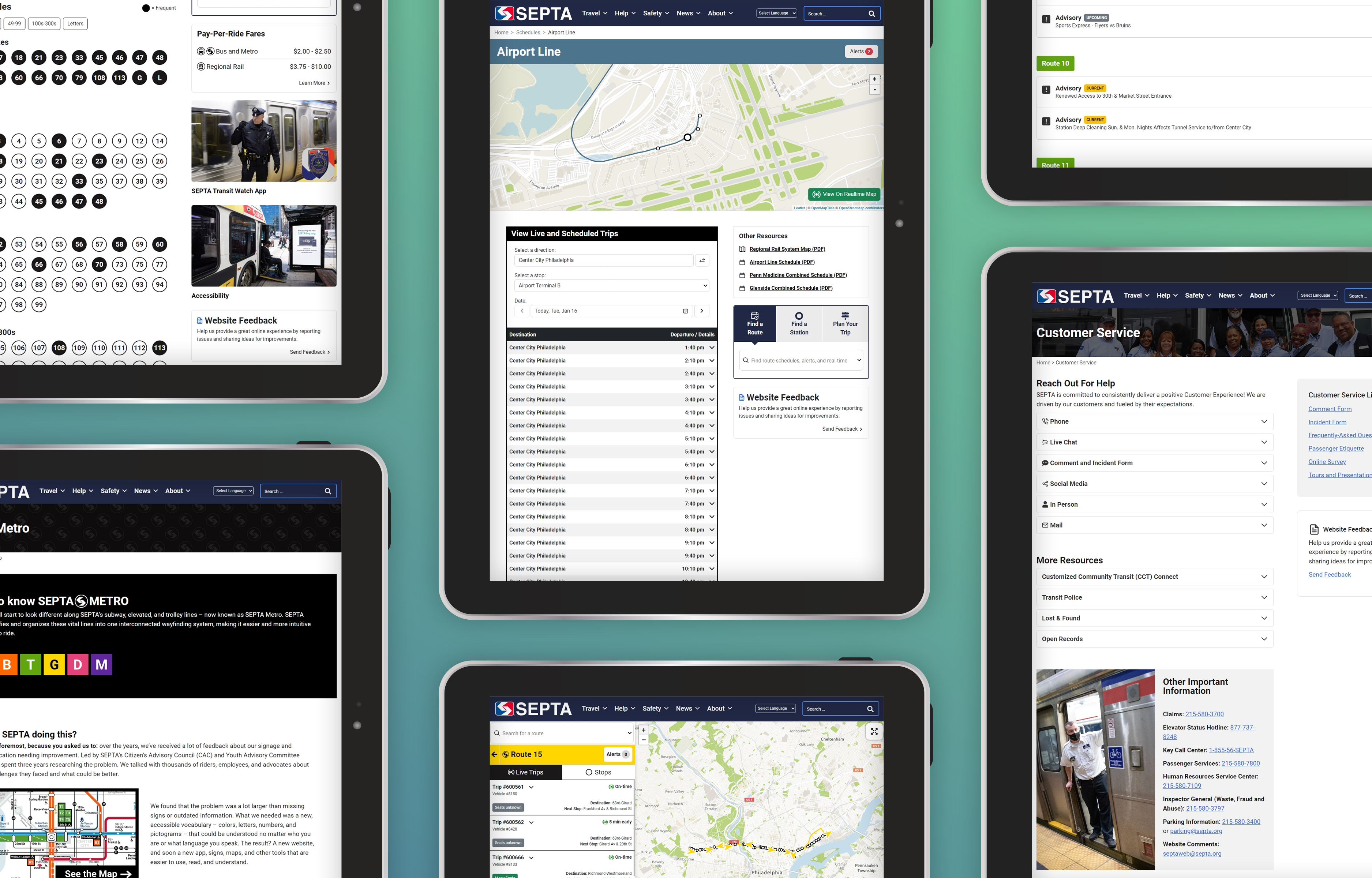
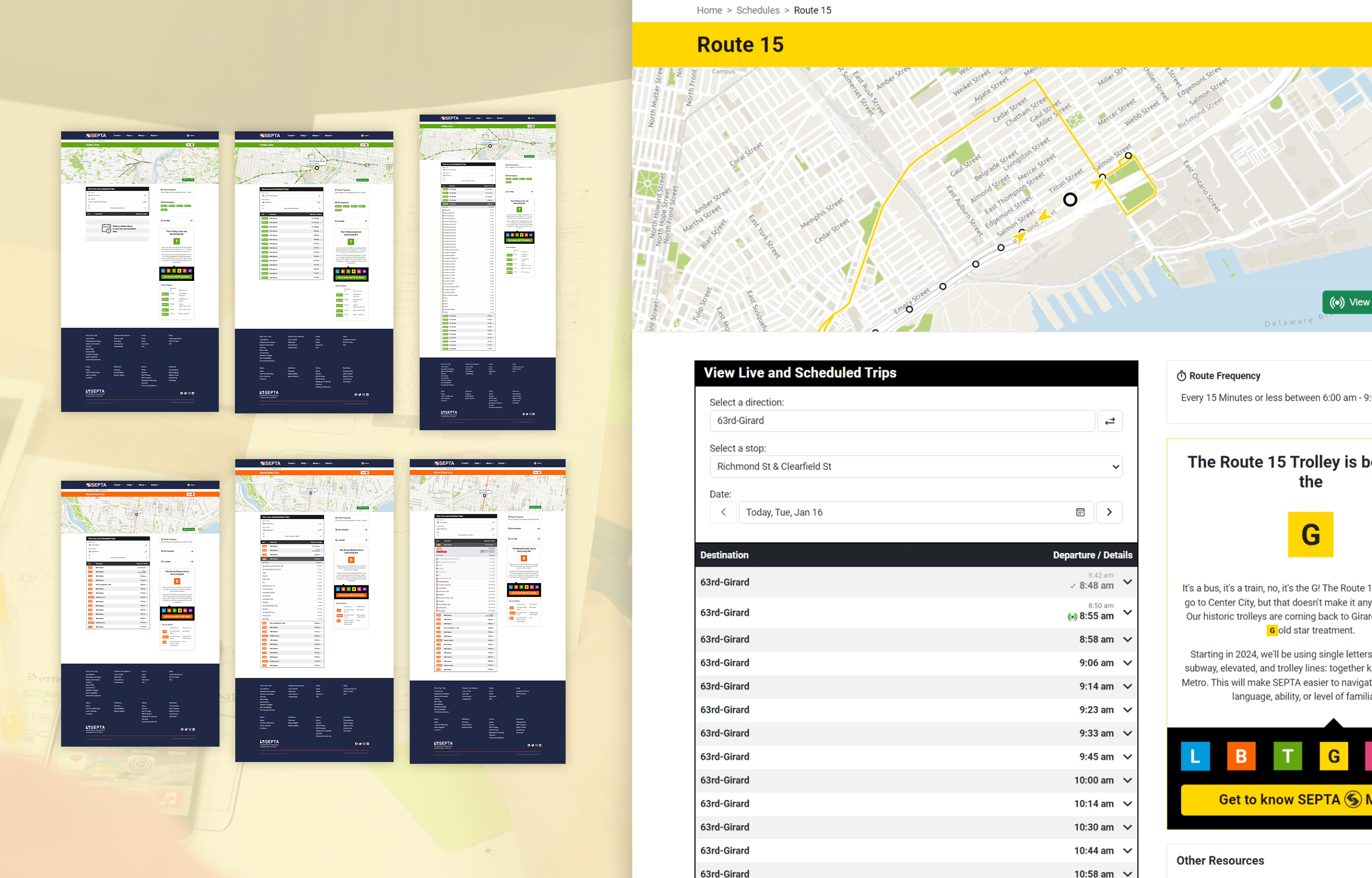
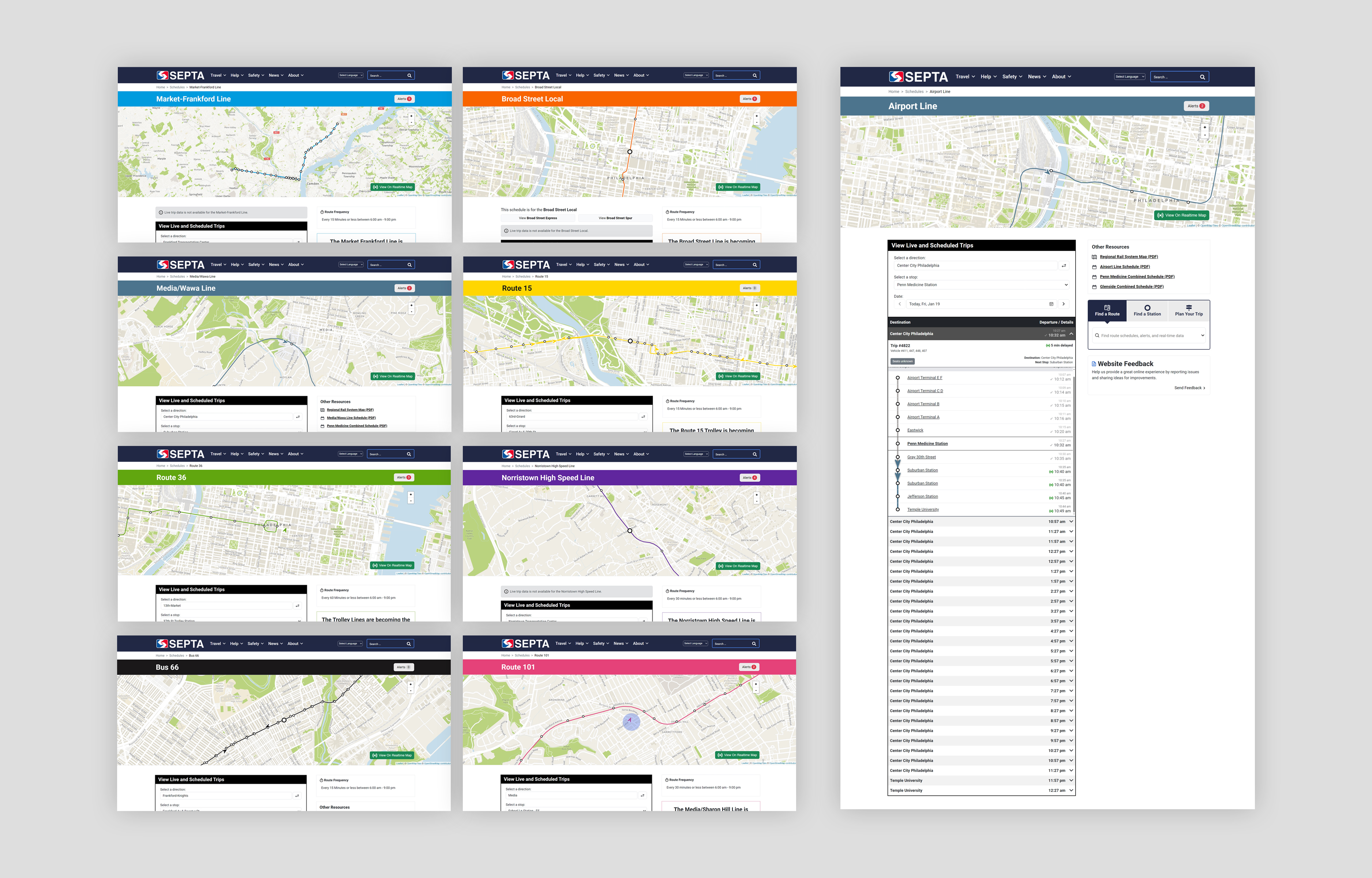
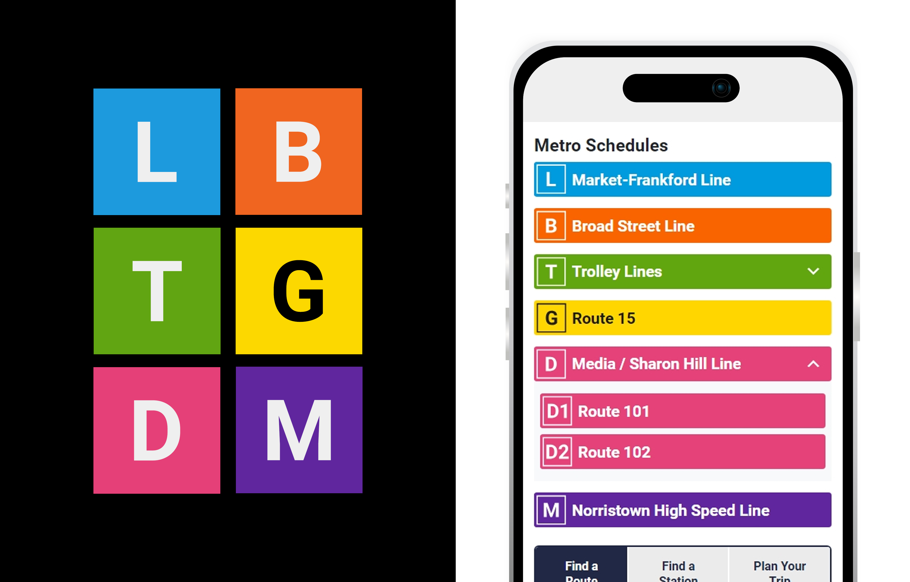
The introduction of SEPTA METRO, a rebranded rail network, greatly influenced the site’s new frontend
design which makes use of METRO’s vibrant color palette, bold lettering, and iconography. Additional
planned content migrations from ISEPTAPHILLY.com and Planning.SEPTA.org will bring SEPTA’s voice and
vision back into the main site while reducing the burden of managing multiple products.
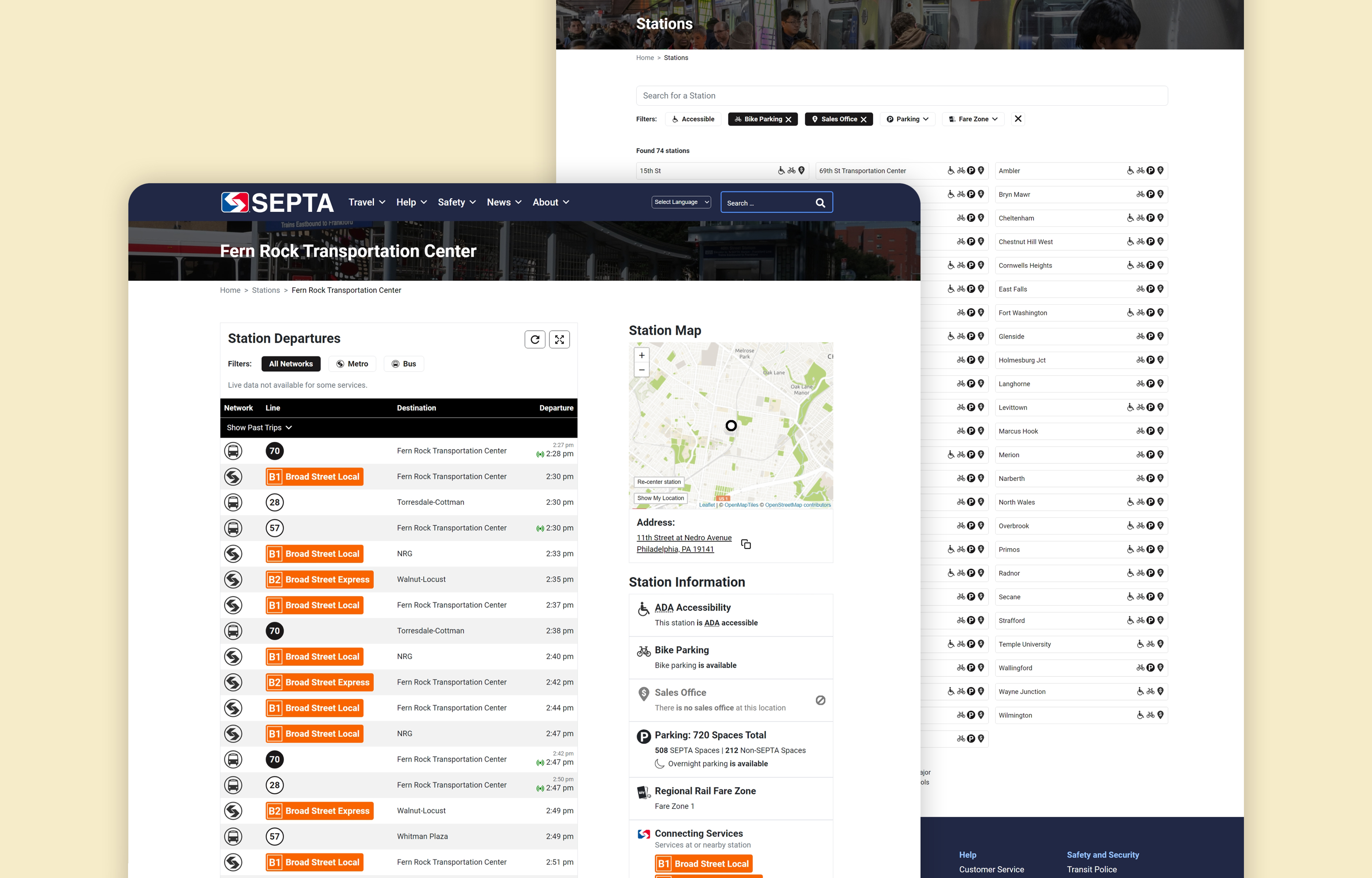
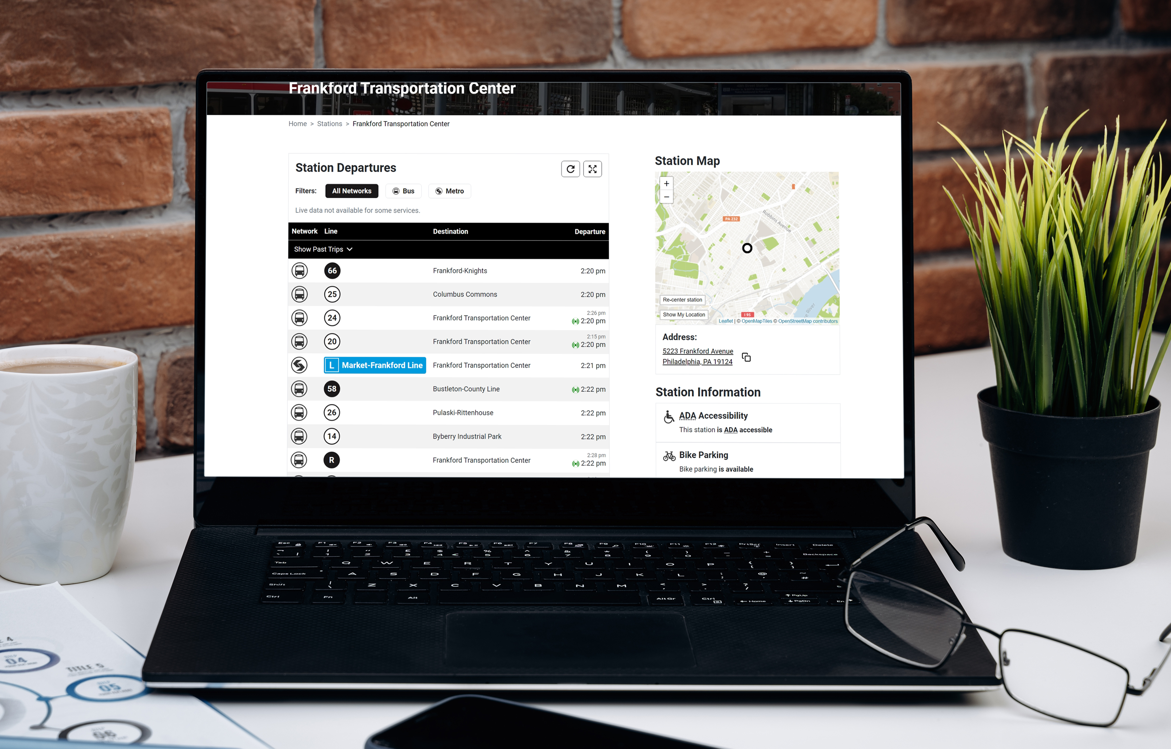
Merging the existing website and a separate, but closely related, data-centric web application was key to
streamlining and improving SEPTA’s primary online experiences. We visually and technically overhauled the
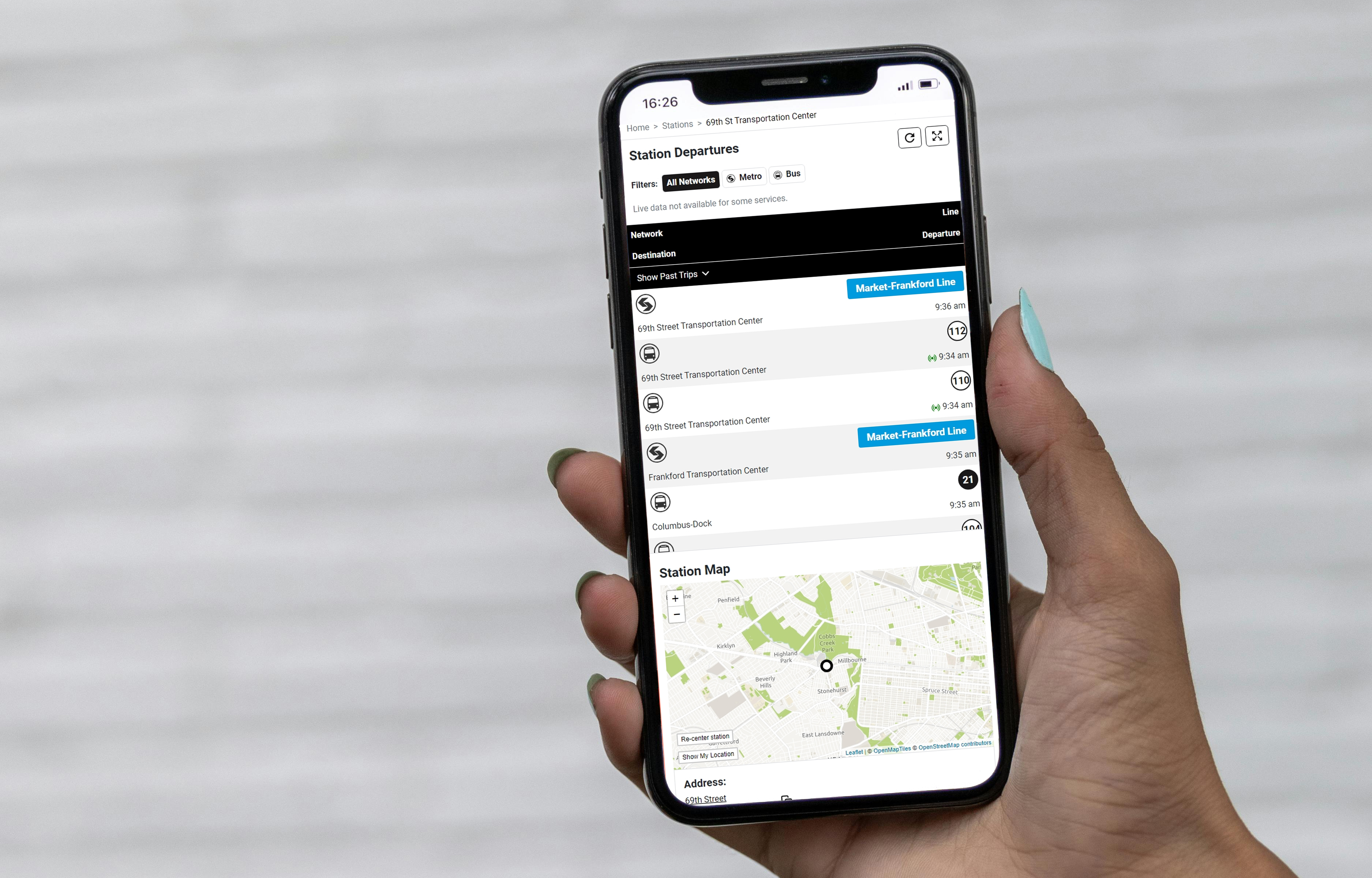
site and app introducing a singular, mobile-optimized user interface and navigation structure that creates
a one-site experience. The redesign introduced several new interactive real-time and trip planning
features inspired by customer feedback, two of which were developed rapidly during the 3-month public beta
period that occurred before launch. A highly collaborative and creative approach with our partners at
SEPTA was pivotal to delivering a project of this scale, complexity, and public importance.
Services:
- App + Web Development
- Data Management
- Graphic Design
